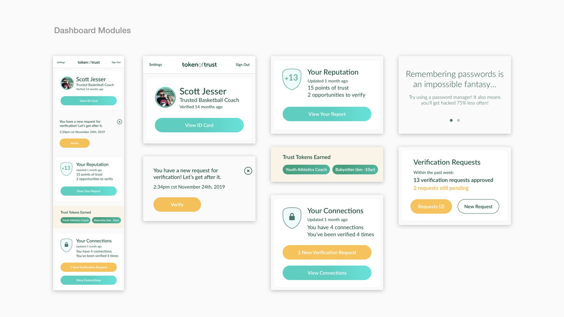
Token of Trust design system
Token of Trust is a startup that helps keep people safe online by quickly and easily verifying and sharing identity reports. It is being used by alcohol distributors, online retailers, independent contractors and childcare professionals.
They asked me to help them broaden their identity verification and protection tools to look and feel more approachable, trustworthy and modern. We also brainstormed new user flows and features that are core parts of the product. I was the only designer on this project.
UX Concerns
Overly complex flows. Dashboard doesn’t deliver value. Needs hierarchy and structure.
Design Limitations
Too much green, feels like finance. Limiting style guide and visual artifacts.
New Use Cases
Consumer insights show that an intuitive dashboard is needed. Demand for social features including the ability to request verification from others and share your own custom reputation report.
Interface / Brand Boards
We shared inspiration and I put together several brand and UI inspiration boards. This led to constructive discussion about features and components as well as sketching out ideas for our system.
Sketching Features
I shared my sketches with Token of Trust as we started to put form to the requirements. I work best through iterating quickly through paper sketches to find the most usable interaction design patterns for the system of features we are building.
A Fresh Design System
Token of Trust verifications and workflows can live in the core product, or be broken out and integrated into emails, third parties, etc. This is why I started with the smallest elements first, assembling into modules and pages later.


